Start with one dominant material, match its undertone across every supporting surface, and repeat at least one element in two places — that single rule, drawn from guidance at Homes & Gardens, ArchDaily, and the craftspeople at Woodmadeillinois, prevents most of the clashing results homeowners regret.
Before committing to any material, run three quick checks:
- Dominant material: Is one material clearly in charge of the room, covering at least 60% of visible surfaces?
- Undertone match: Do the warm or cool tones in your primary material appear in at least one supporting material?
- Texture balance: Does the room include at least one matte, one mid-sheen, and one tactile surface so no single finish overwhelms the eye?
Key Takeaways
Mixing materials successfully comes down to one discipline: match undertones first, then layer texture and proportion around that foundation.
| Point | Details |
|---|---|
| Undertone match is non-negotiable | Choose a base temperature (warm or cool) and keep most materials within that family before anything else. |
| Start with the fixed element | Anchor the entire palette to the floor or another permanent surface; layer movable elements afterward. |
| Apply the 70/20/10 rule | Dominant material at 70%, supporting at 20%, accent at 10% keeps the composition readable and intentional. |
| Resolve every material join | A carpentry reveal or threshold detail at each transition prevents an assembled look and signals deliberate craft. |
| Woodmadeillinois for built projects | Custom carpentry consultations and installations in Central Illinois translate sample-board plans into finished rooms. |
Table of Contents
- How to mix materials in interior design: a 5-step planning method
- What material pairings actually work in real rooms?
- How do undertones and color temperature keep materials from clashing?
- How much of each material should you use?
- Durability, maintenance, and cost: what to check before you commit
- Common mistakes when mixing materials and how to fix them
- Your pre-purchase planning checklist
- The part of material mixing most guides get wrong
- Woodmadeillinois brings your material plan to life in Central Illinois
- Sources
How to mix materials in interior design: a 5-step planning method
Designers consistently begin with the floor or another fixed, permanent surface — and for good reason. That surface sets the temperature of the entire room before a single piece of furniture arrives.
-
Anchor to a fixed element. Identify the floor, an existing stone fireplace, or a structural beam as your starting point. Decide whether it reads warm (amber oak, terracotta tile) or cool (gray slate, white marble). Every subsequent choice should lean into that temperature or deliberately contrast it with restraint.
-
Choose a dominant material and a supporting palette. The dominant material covers the largest area — flooring, cabinetry, or a feature wall. Pick two supporting materials that share at least one undertone with it. Repeat each supporting material in at least two locations so the eye reads intention, not accident.
-
Layer textures and finishes. Once the palette is set, vary surface character: pair a matte plaster wall with a low-sheen timber floor and a single glossy ceramic tile as a backsplash accent. When color is restrained, texture becomes the primary storytelling device, so finish samples must be seen together and in the actual room light before you commit.
-
Set proportions deliberately. A proportional split with dominant material making up most of the space, supporting materials adding secondary interest, and small accents creating highlights keeps the composition legible. Accent materials (brushed brass hardware, a single glass panel) should surprise without competing.
-
Finish with accessories and lighting. Place samples on the floor and wall simultaneously, then observe them at morning light, midday, and under your artificial fixtures. Warm incandescent or LED-warm bulbs shift cool gray stone toward beige; cool daylight bulbs do the reverse.
Pro Tip: A custom carpentry reveal or shadow-gap detail between two dissimilar materials — say, a timber panel meeting a painted drywall return — creates a deliberate pause that makes the transition read as designed rather than unresolved. Woodmadeillinois uses this technique on accent wall installations to unify materials that would otherwise fight each other at the join.
In a living room, this method might mean walnut flooring (dominant, warm) paired with a linen sofa (supporting, warm-neutral) and a single smoked-glass side table (accent, cool contrast). In a kitchen, white shaker cabinetry (dominant, cool) works with a warm quartzite countertop (supporting) and matte black hardware (accent). A home office benefits from a painted MDF built-in (dominant, neutral) layered with a solid-wood desktop and a woven textile chair — the wood and textile share a natural, organic warmth that keeps the workspace from feeling clinical.
What material pairings actually work in real rooms?
Mixing materials must create harmony first — materials should “correspond” so undertones and textures feel intentional rather than random. The pairings below each carry a specific visual logic.
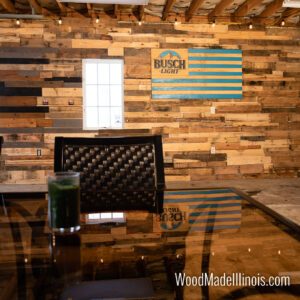
- Wood + glass: Glass reads as weightless and cool; timber grounds it with warmth and grain. Best in living rooms and dining spaces where you want openness without coldness. A pallet wood accent wall behind a glass-top dining table is a low-cost version of this pairing that punches well above its budget.
- Wood + stone + metal: The classic triad for kitchens and bathrooms. Stone provides mass and cool mineral tones; wood softens; metal (brushed nickel or aged brass) ties the two by echoing either the cool or warm register. Keep the metal finish to one family throughout.
- Concrete + warm wood: Concrete carries industrial weight and a cool gray undertone. Warm oak or walnut flooring alongside it prevents the space from reading as a parking structure. This pairing suits open-plan living areas and home offices where you want a modern edge without austerity.
- Mixed timbers: Two wood species can coexist if their undertones align. Pale ash and warm oak both carry yellow-gold tones; they read as a considered collection. Ash paired with dark wenge, however, creates undertone conflict unless a unifying element — a shared stain, a repeated textile — bridges them.
- Textiles with glossy surfaces: A high-sheen lacquered cabinet or polished marble countertop needs a soft counterweight. Linen curtains, a wool rug, or a velvet cushion absorb the visual energy of reflective surfaces and make a room feel finished rather than cold.
| Pairing | Visual effect | Maintenance | Best rooms |
|---|---|---|---|
| Wood + glass | Open, warm-modern | Low (glass wipes clean; wood needs periodic sealing) | Living, dining |
| Wood + stone + metal | Grounded, layered | Moderate (stone sealing; metal polishing) | Kitchen, bathroom |
| Concrete + warm wood | Industrial-warm | Low-moderate (concrete sealing; wood oiling) | Open-plan, office |
| Mixed timbers | Collected, organic | Low (consistent finish products) | Bedroom, study |
| Textiles + glossy surfaces | Balanced, tactile | Moderate (fabric cleaning; surface polishing) | Living, bedroom |
Pro Tip: Repeat an undertone across two materials rather than matching their color. Warm brass hardware and warm-toned oak flooring share a yellow-gold register; they correspond without being matchy. That shared temperature is what makes a room feel curated.
How do undertones and color temperature keep materials from clashing?
Color and texture directly influence space perception; the chromatic circle and deliberate sample testing are the most reliable tools for aligning them. Undertones are the secondary hues embedded in a material’s surface — the pink in a white marble, the green in a gray slate, the yellow in a natural oak. When two materials share an undertone family, they correspond even if their surface colors differ widely.
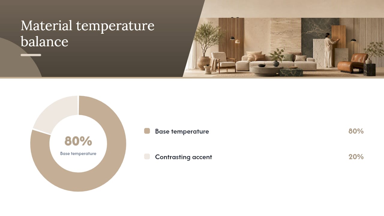
The practical approach: pick a base temperature (warm or cool) for the room, keep 80% of materials within that family, and use one contrasting temperature as a single accent. A room built on warm tones — amber wood, cream plaster, terracotta tile — can absorb one cool element, such as a steel-framed window or a slate-blue textile, without losing coherence. Two competing temperatures at equal weight produce visual tension that most people register as “something feels off” without being able to name it.
Quick undertone checks:
- Hold a white piece of paper next to your material sample. If the sample looks yellow or orange by comparison, it reads warm. If it looks blue or green, it reads cool.
- Test samples under both natural daylight and your planned artificial lighting. The same stone tile can shift from warm cream to cool gray depending on the bulb color temperature.
- Photograph the assembled samples together. The camera flattens the scene and makes undertone conflicts more visible than the eye catches in person.
Pro Tip: A repeated textile color — a cushion, a rug, a curtain — is the fastest way to harmonize two materials whose undertones are slightly mismatched. The textile acts as a visual translator between them, picking up tones from both surfaces and blending them into a single read.
How much of each material should you use?
A clear material hierarchy — primary, secondary, accent — prevents visual noise and keeps a composition legible at a glance. Visual weight is the perceived heaviness of a surface: dark, matte, rough materials read as heavy; light, glossy, smooth ones read as light. A room where every surface carries the same visual weight feels flat; one where weight is distributed deliberately feels dynamic.
The 70/20/10 rule applies to materials as naturally as it does to color. Seventy percent dominant, twenty percent supporting, ten percent accent. Breaking the rule is fine — but break it with intention, not by accident.
Practical layout adjustments that shift perceived proportion:
- A large-format rug in the dominant material’s color family makes the floor read as a single unified plane, reducing the visual noise of a complex tile pattern beneath it.
- Raising trim height (baseboards, door casings) in a contrasting material draws the eye upward and makes a low ceiling feel taller.
- Repeating a material across a sightline — the same timber on a built-in shelf unit and on a window seat across the room — creates rhythm without adding more material types.
Pro Tip: Carpentry reveals and skirting details are the most cost-effective tools for adjusting perceived scale. A deep shadow-gap baseboard in a dark stain makes a light-colored floor appear to float; a painted MDF panel molding applied to a plain wall adds apparent mass and depth without touching the underlying structure.
Durability, maintenance, and cost: what to check before you commit
Mixing materials must respect functional constraints — fire safety, moisture resistance, and durability — so aesthetics cannot override suitability. A beautiful reclaimed-wood floor in a bathroom is a maintenance problem waiting to happen; a polished marble countertop in a high-traffic family kitchen will show every scratch within a year.
Cost-shaping factors for carpentry-led projects: material type (solid hardwood costs more than MDF or engineered alternatives), fabrication complexity (custom built-ins take longer than flat-pack assembly), installation access (tight spaces or historic homes with irregular walls add labor hours), and repairability (solid wood can be refinished; laminate cannot).
Red flags that require professional input before proceeding:
- Any material change that touches a load-bearing wall or structural element
- Moisture-exposed installations (bathrooms, laundry rooms, below-grade spaces) where vapor barriers and appropriate sealants are non-negotiable
- Historic homes where original trim profiles or plaster details need to be matched rather than replaced
For a realistic timeline and material budget, custom carpentry projects such as built-in shelving or accent walls typically run two to four weeks from design sign-off to installation, depending on material lead times. Woodmadeillinois offers consultations that translate a material plan into a buildable scope with a clear cost range — a useful step before purchasing anything. For budget-conscious updates, cost-effective interior upgrades can refresh a room’s material story without a full renovation.
Common mistakes when mixing materials and how to fix them
Simple harmony rules — one dominant style, repeated elements, limited metal finishes — are the most reliable fixes for mixed-material chaos. Most rooms that feel “off” have committed one of five errors.
Too many material types. If you can count more than five distinct materials in a single room, the composition is likely competing with itself. Remove or consolidate: replace two similar-but-different wood tones with one consistent species, or swap a patterned tile for a plain one that echoes the floor.
Competing wood undertones. A yellow-toned pine floor paired with a red-toned cherry cabinet creates undertone conflict. Fix: introduce a textile or paint color that contains both undertones (a warm ochre, a muted terracotta) to act as a visual bridge.
Overuse of glossy finishes. Three or more high-sheen surfaces in one room create visual fatigue. Add a matte element — a limewash wall, a honed stone, a linen blind — to absorb the reflective energy.
Ignoring transitions at joins. Where two materials meet — timber floor to tile, drywall to stone cladding — an unresolved edge reads as unfinished. A simple carpentry detail (a timber threshold, a metal trim strip, a routed reveal) closes the gap cleanly.
Lighting that flattens texture. Overhead-only lighting eliminates the shadows that give texture its depth. Add a directional wall sconce or an angled picture light to rake across a textured surface and restore its visual interest.
Quick fixes to try before calling a contractor:
- Swap a synthetic rug for a natural-fiber one (jute, sisal, wool) to add warmth and texture without touching the walls
- Repaint trim in a color that shares an undertone with the dominant material
- Replace mixed metal hardware with a single finish throughout
Pro Tip: At a material join, a 3–5mm shadow gap routed into the face of a timber panel where it meets a plaster wall costs almost nothing in labor but reads as a deliberate architectural detail. It signals craft and intention at exactly the point where two materials are most likely to look unresolved.
Your pre-purchase planning checklist
High-end designers use assembled touch-and-feel boards and curated sample libraries to make confident mixed-material choices before a single item is purchased. The checklist below follows the same logic.
- Primary material confirmed: species, finish, and supplier lead time noted.
- Supporting palette selected: two materials chosen, each sharing an undertone with the primary.
- Undertone test completed: samples held against white paper and photographed together under natural and artificial light.
- Lighting test done: samples observed at morning, midday, and evening under planned fixtures.
- Repeat rule applied: each supporting material appears in at least two locations on the floor plan.
- Maintenance expectations set: cleaning method and resealing schedule noted for each material.
- Budget and timeline targets recorded: material cost, fabrication cost, and installation window confirmed.
- Sample board assembled: physical samples pinned or taped together at scale, including paint chips, fabric swatches, and hardware.
Questions to ask your carpenter or installer before signing off:
- What finish tolerance do you work to, and how do you handle expansion gaps between materials?
- How do you detail the junction between [material A] and [material B] at the floor/wall/ceiling?
- What is your lead time for custom fabrication, and what triggers a change-order cost?
- Which materials in this plan require special substrate preparation or moisture barriers?
For flooring decisions specifically, reviewing top flooring options for renovation before your consultation helps you arrive with informed questions rather than starting from scratch.
The part of material mixing most guides get wrong
Most guides on combining textures in decor treat undertone matching as a finishing touch — something to refine after the big decisions are made. That sequencing is backwards. Undertone is the skeleton of a material mix. Get it wrong at the dominant-material stage and no amount of accessory-swapping will fix the result.
The second error is treating carpentry details as decoration rather than as structural grammar. A shadow gap, a reveal, a carefully profiled baseboard — these are not ornamental. They are the punctuation marks that tell the eye where one material ends and another begins. Without them, even a well-chosen palette reads as unresolved. Rooms that feel “designed” almost always have resolved transitions; rooms that feel “assembled” almost never do.
The conventional advice to “limit yourself to three materials” is useful but incomplete. Three materials with mismatched undertones will clash. Five materials with a shared warm register can coexist beautifully. The number matters less than the correspondence. Spend your planning time on undertone alignment and transition details, and the material count will take care of itself.
Woodmadeillinois brings your material plan to life in Central Illinois
Translating a material plan from a sample board to a finished room is where most projects stall. Woodmadeillinois offers custom carpentry consultations and installations for homeowners and small businesses across Central Illinois, with over 100 years of combined carpentry experience behind every project. Services include accent and pallet wood walls, built-in storage, kitchen builds, and ergonomic home office installations — the exact carpentry-led interventions this guide describes.
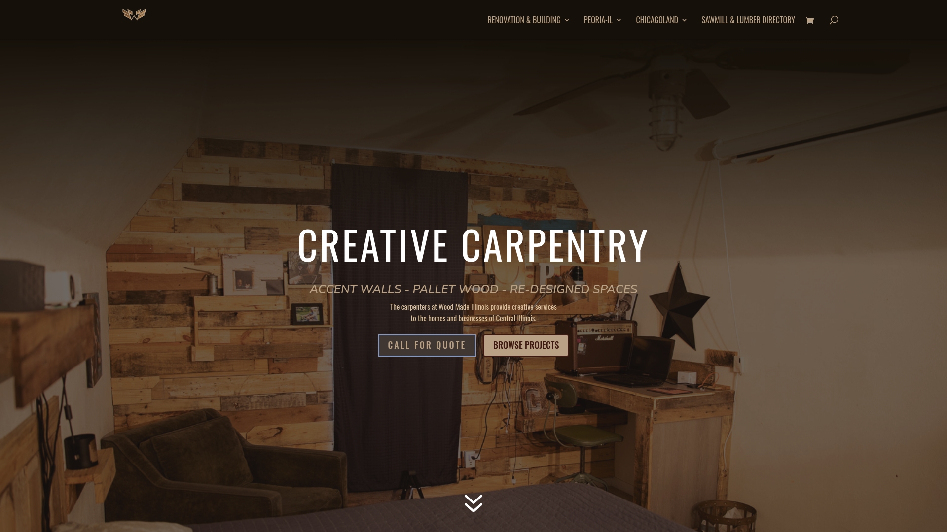
Whether you need a shadow-gap detail resolved at a material join, a built-in that anchors a room’s dominant material, or a full design consultation to work through your sample board, the team at Woodmadeillinois can scope the work and give you a realistic timeline and cost range. Reach out through the trusted local carpentry experts page to start the conversation.
Sources
- Mixing Materials in Modern Interior Design: Usage Guide – BibLus
- How to mix and match materials in the home, according to an expert | Homes and Gardens
- How to Combine Colors and Textures in Interior Decor | ArchDaily
- Material Mixing Guide – Dök Mimarlık
- Designing with Texture | Interior Trends — Mayfair Building Co
- Architecturecourses
- Mixing Materials in Your Home Interior | Jamie’s Journal