The best accent wall is not a color decision. It is the unbroken wall your eye lands on first when entering a room, and the strongest candidates are usually the wall behind the bed, the fireplace wall, the wall behind the main sofa, or an end-of-hall wall you face on entry. If none of those exist, the ceiling can serve as your fifth wall. Everything else, including the color, follows from that one placement choice.
TL;DR:
- The best accent wall should be chosen based on the focal point that naturally attracts the eye from the entry, such as the headboard, fireplace, or main seating area.
- The wall needs to be unbroken, well-centered, and ideally feature an inside corner for a cohesive, intentional look.
- Light direction influences suitable colors, with south and west-facing rooms tolerating deeper tones, while north-facing rooms benefit from warmer, lighter shades.
- Reversible paint with proper priming is ideal for accent walls, but textured finishes and wood accents require professional help for proper installation.
- Arranging furniture to face or be centered on the accent wall enhances its visual impact, and placement can affect room perceived size and coziness.
Table of Contents
- Accent Wall Placement Rules Designers Actually Follow
- Which Wall Works Best in Each Room?
- How Light Direction Should Shape Your Color Choice
- Matching Material to the Wall You Choose
- Pro Tips From Wood Made Illinois’s Carpenters
- Does Your Room’s Color Palette Actually Matter?
- Arranging Furniture and Decor Around Your Accent Wall
- Can Placement Make a Room Feel Bigger or Cozier?
- Why Placement Beats Trend-Chasing
- When to Call in a Carpenter for Your Accent Wall
- Sources
Accent Wall Placement Rules Designers Actually Follow
Placement decisions come before paint chips, and the rule holds up in almost every room: choose the wall that already attracts the eye from the entry. Stand in the doorway and notice where your attention goes first. Nine times out of ten, that’s your fireplace, your headboard, or a built-in you already treat as the room’s anchor.
That focal wall also needs to stay whole. Designers recommend an unbroken surface so the accent reads as a deliberate design move rather than a leftover patch of color squeezed between two doorways. A wall chopped up by a closet door, a window, and a light switch fights the eye instead of guiding it.
Symmetry matters almost as much as size. A wall centered behind a bed or sofa, with matching lamps or art flanking the furniture, reinforces the sense that the room was planned. If your best wall isn’t perfectly centered, you can still fix the imbalance with furniture placement or a piece of art hung slightly off-center to visually rebalance the space.
One detail carpenters notice before homeowners do: inside corners read more intentional than outside corners. A color that wraps into an inside corner feels tucked and cohesive. The same color turning an outside corner looks like it ran out of room.
Before you commit, walk the space and check for:
- A clear sightline from the main entry point
- At least 80% unbroken surface, free of multiple doors or windows
- Furniture that can center on or frame the wall
- An inside corner rather than an outside corner, where possible
Pro Tip: Stand in every doorway of the room, not just the main one. If a second entrance reveals a completely different focal point, you may have two legitimate candidate walls, and the room’s furniture layout should settle which one wins.
Which Wall Works Best in Each Room?
Room type changes the calculus slightly, but the focal-point rule still drives every choice.
- Bedroom. The wall behind the headboard wins almost by default. If that wall is interrupted by windows, shift the accent to the wall you see first when you wake up instead of forcing color onto a broken surface.
- Living room. Fireplace walls and sofa walls are the classic picks. When a television dominates the layout, favor the wall the seating faces rather than the wall the TV hangs on. Accenting behind the screen often gets lost.
- Home office. Choose the wall behind your desk, or better, the wall you face on video calls. That second option quietly upgrades every meeting background without you doing anything else.
- Dining rooms and hallways. An end wall or the wall running parallel to the table works well. In narrow hallways, a single end wall creates a visual stopping point instead of a tunnel effect.
- Small rooms with no clear candidate. Treat the ceiling as a fifth wall. It’s often the only truly unbroken surface in a tight space.
Watch for fragmented walls (multiple doors, oddly placed windows) or awkward layouts where no wall is dominant. In those cases, it’s worth rethinking the whole approach before you buy paint.
How Light Direction Should Shape Your Color Choice
Once the wall is settled, light decides how far you can push the color. South and west-facing rooms tolerate deeper, more saturated tones because afternoon sun keeps the color from feeling heavy. North-facing rooms get flatter, cooler light throughout the day, so the same charcoal or forest green that glows in a sunroof can go dull and lifeless on a north wall. In those rooms, lean toward warmer, lighter tones, or add more sheen to bounce back what light there is.
Contrast is the other half of the equation. The accent wall needs to read as visibly different from the surrounding walls, or the effect disappears into the background. This is the same logic behind Light Reflectance Value ratings on paint cards: a wall with noticeably lower reflectance than its neighbors will stand out, while a wall only a shade or two darker often just looks like a mismatch.
Before buying a gallon, keep in mind:
- Test a sample panel at least two feet square, not a paint chip
- View it in morning, midday, and evening light
- Check how it looks under your actual lamps at night, not just daylight
Practitioners routinely recommend viewing large test panels across multiple times of day rather than trusting a small chip under store lighting, since color often shifts dramatically between morning and evening light. Carrying the wall color up onto the ceiling can deepen a cozy room further; keeping the ceiling white works better in rooms already short on light.
Matching Material to the Wall You Choose
Paint remains the most reversible, budget-friendly option, and it’s forgiving if you change your mind next year. Saturated colors almost always need two full coats over a properly primed surface. Skip a coat at the edges and you’ll see visible “picture-framing” within a year as the field and edges age at different rates.
Wallpaper and heavily textured finishes shine on unbroken walls and in smaller rooms, where a bold pattern won’t overwhelm the eye. Just scale the pattern to the room; an oversized print in a tight hallway can feel closer than it is.
Wood slats, pallet wood, and built-in carpentry sit at the other end of the spectrum. They’re less reversible but add genuine texture, and a carpenter can integrate shelving or lighting directly into the wall. Consider hiring help once you’re talking about structural mounting or wood accent wall installations rather than a weekend paint job.
- Paint: cheap, reversible, needs two coats for saturated colors
- Wallpaper: best on unbroken walls, watch pattern scale
- Wood or built-ins: most texture and function, usually worth a professional install
Pro Tips From Wood Made Illinois’s Carpenters
After enough jobs, certain mistakes show up again and again. Homeowners pick a wall for convenience (an outlet, a blank stretch near the TV) rather than sightline, and the room never quite feels finished.
- Do the doorway sightline test before measuring anything
- Mount a full-size test panel, not a paint chip, and view it across a full day
- Watch for under-primed edges; that’s where picture-framing starts
- Consider a pallet wood accent wall when you want built-in storage or lighting, not just color
Pro Tip: If your “best” wall is broken up by two doorways and a window, don’t force it. A smaller architectural niche or a vertical wood slat treatment often reads more intentional than a full wall fighting its own interruptions.
Does Your Room’s Color Palette Actually Matter?
Placement earns the wall its authority, but the room’s existing palette decides whether the accent feels like it belongs or like an afterthought. A navy accent wall in a room full of warm oak furniture and rust-toned textiles will clash even if the placement is flawless. The fix isn’t abandoning navy; it’s pulling one supporting color from the new wall into a pillow, a rug, or a lamp shade elsewhere in the room so the eye has a reason to connect the two.
Style compatibility works the same way. A farmhouse living room with shiplap trim and distressed wood furniture calls for a different accent treatment than a mid-century space with clean lines and walnut tones. 2026 design trends lean toward tonal accents and natural materials rather than one random bold wall dropped into an otherwise neutral room. That shift favors homeowners who think about the whole palette first, since a tonal wood or clay tone tends to age better than a trend color chosen in isolation.
If your existing palette is already busy, muted and closely related tones will outperform a high-contrast statement color. If your palette is mostly neutral, that’s exactly the room where a bolder accent has room to breathe without competing against patterned furniture or busy artwork.
Arranging Furniture and Decor Around Your Accent Wall
An accent wall works with the room, not against it. Furniture should generally sit against or in front of the accent wall rather than pushed to a side wall, since that’s what turns the color into a backdrop for daily life instead of a stripe of paint nobody interacts with. A sofa centered on the wall, or a bed frame flush against it, does more visual work than the color alone.
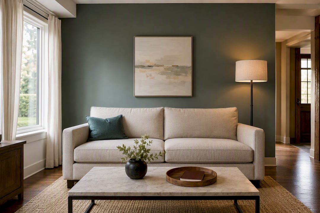
Artwork and shelving need restraint on an accent wall. Because the wall is already doing the heavy lifting visually, cluttering it with too many frames or a gallery wall competes with the color instead of complementing it. One or two well-placed pieces, sized to the wall, read as intentional. A dense cluster reads as indecisive.
Lighting deserves a second look too. A wall sconce or picture light aimed at the accent wall extends its impact into the evening, when overhead lighting alone can flatten a saturated color. For guidance on hanging art and coordinating a wall’s decor with the rest of the room, planning wall decor thoughtfully prevents the common trap of treating the accent wall and the room’s decor as two separate projects.
Can Placement Make a Room Feel Bigger or Cozier?
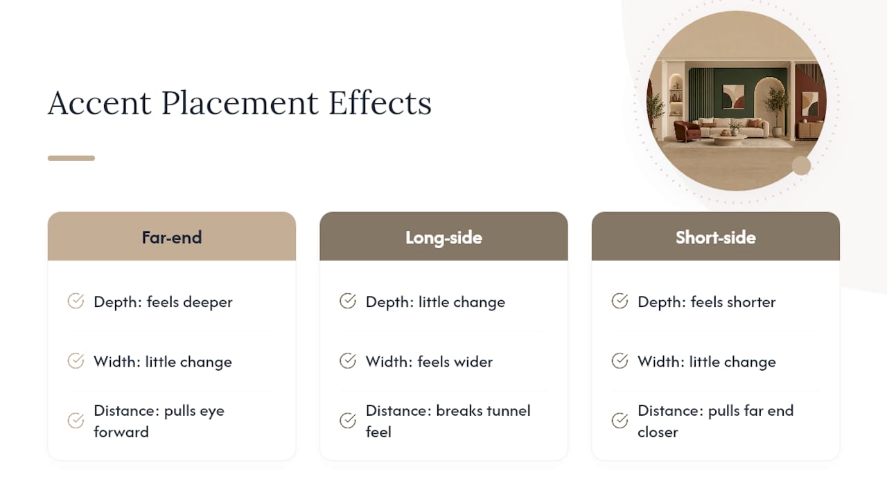
Where you put the accent wall changes how large or small the room feels, sometimes more than the color itself. An accent wall placed at the far end of a room, the one you walk toward, pulls the eye forward and can make a shallow room feel deeper. That’s part of why end-of-hall walls work so well in narrow hallways; they give a long, tight space a destination instead of a blank stretch.
Side walls behave differently. Accenting a long side wall in a narrow room tends to make the space feel wider, since the color interrupts the sense of a tunnel running lengthwise. Accenting a short wall in a long room can shorten the perceived distance, pulling the far end visually closer.
Ceilings do the opposite job. A ceiling accent, whether paint or wood, lowers the perceived height of a room, which can make a tall, echoey space feel warmer and more enclosed. In a room that already feels cramped, that same ceiling treatment can backfire, so it’s worth reserving for rooms with real height to spare.
Why Placement Beats Trend-Chasing
Placement decisions hold up for years because they’re tied to the room’s architecture, not a passing color trend. A wall chosen for its sightline and proportion still works after the next paint trend fades. Our carpentry background at Woodmadeillinois has shown us that the budget-friendly fixes usually beat expensive overhauls, and paint stays the most reversible choice of all.
— Wood
When to Call in a Carpenter for Your Accent Wall
If your best wall is a simple, unbroken surface, paint and a weekend are often all you need. But once you’re considering wood slats, a pallet wood feature, or a built-in with integrated shelving and lighting, that’s carpentry territory, and it’s where Central Illinois homeowners may consider professional carpentry services for a wall that needs more than color to earn its place as the room’s focal point, without the cost or delay of a full renovation.
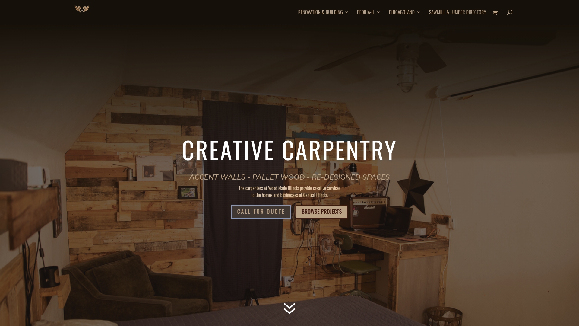
Our design consultations start with the same sightline test covered above, then match the wall to a material that fits your budget and timeline, whether that’s a textured wood panel, a pallet wood accent, or a custom built-in with storage worked in. If you’re ready to see what a professionally installed accent wall could look like in your own space, reach out to Woodmadeillinois’s carpentry team and get a straightforward quote before you commit to a single gallon of paint.
Sources
- How To Choose a Stunning Accent Wall for Your Home – This Old House
- Accent wall tips and mistakes – Good Housekeeping
- Accent Wall 2026: Colours, Rules & What Actually Works – Deavita