Pick your stain color by working through four steps in order: define the look you want, cut sample boards from your actual wood species, test your top choices in the room’s real lighting, then match stain type and opacity to that sample before committing. This sequence is built around manufacturer standards like pre-stain conditioner timing and wipe-off discipline, and it works because it removes guesswork at every stage.
TL;DR:
- Choose a mid-tone, neutral stain and test it on samples from each wood species to ensure color cohesion across different grains and pigments.
- Use gel stains for blotchy woods like pine and maple, and consider a shellac wash coat to improve stain absorption on softwoods.
- Pick the right stain type based on your project: water-based for quick drying, oil-based for depth, and gel for surface application over old finishes.
- Always apply stain consistently following a step-by-step protocol, including proper sanding, dust removal, and timing, to achieve predictable results.
- View stain samples in your actual room lighting, not store lighting, and match your stain tone to fixed room elements and hardware finishes for a harmonious look.
Table of Contents
- Quick Decision Framework: Three Questions Before You Buy Samples
- How Wood Species and Undertones Change Stain Color
- Pick the Stain Family and Opacity: Oil vs. Water vs. Gel
- How to Sample and Test Stain Colors: A Repeatable Protocol
- Prep and Application: Step-by-Step Execution for Predictable Results
- Common Mistakes and Troubleshooting
- Finishing, Maintenance, and Longevity
- Advanced Techniques: Layering, Two-Tone, and Custom Colors
- Practitioner Tips and Checklists From Experienced Carpenters
- How to Match Stain Tone to Your Existing Décor
- Understanding Stain Color Charts and How to Interpret Them
- Author Perspective: Why Sample-First Wins
- Sources
Quick Decision Framework: Three Questions Before You Buy Samples
Before you stand in the stain aisle comparing forty shades of brown, answer three questions. This narrows your options fast and keeps you from buying six cans you will never use.
Are you enhancing the wood or transforming it? A stain that showcases oak’s grain does a completely different job than one meant to make pine look like walnut. Decide which outcome you want first, because that decision drives everything downstream.
What undertone does your room already carry? Warm rooms with yellow or red-toned light pull best from amber, honey, and cherry stains. Cool, north-facing rooms tend to read blue-gray flooring or gray-washed wood as more natural. Look at your existing trim, flooring, and furniture before picking a direction.
How much coverage do you actually need? Your opacity goal depends on the project:
- Transparent stains let grain and figure show through almost completely, best for showcase pieces like a dining table
- Semi-transparent stains add color while keeping some grain visibility, a common choice for cabinets and doors
- Semi-solid and solid stains hide more of the wood’s natural pattern, useful for uneven lumber or exterior siding facing weather
- Exterior projects need a stain rated for UV and moisture exposure, while interior furniture prioritizes durability under daily handling
How Wood Species and Undertones Change Stain Color
The same can of stain looks like a different product on different wood, and that is not a defect. It is chemistry. Pine and poplar are notoriously blotch-prone because their grain absorbs pigment unevenly, soaking up color in some spots while resisting it in others. Red oak, by contrast, accepts stain more predictably thanks to its open, consistent grain structure. Maple and cherry behave differently still. Maple’s tight grain resists penetration and often needs a conditioner or gel stain to avoid a blotchy, patchy look, while cherry darkens naturally over time regardless of what stain you apply.
Undertones complicate the picture further. A “neutral” walnut stain can pull yellow on pine, red on cherry, and almost gray on white oak, because the wood’s own pigment mixes with the stain pigment rather than sitting on top of it. If you’re working across multiple wood types in one project, choosing a mid-tone, neutral stain and testing it on a sample board from each species is the only reliable way to keep the final look cohesive.
Two species-specific fixes are worth knowing:
- On blotch-prone softwoods, a thin shellac wash coat evens out absorption more reliably than heavy sanding or aggressive conditioning
- Gel stain sits closer to the surface rather than penetrating deeply, making it a practical choice for pine, maple, and refinishing jobs where old color needs covering rather than blending
Pick the Stain Family and Opacity: Oil vs. Water vs. Gel
Product type matters almost as much as color. Oil-based stains penetrate deeper, build richer color, and give you a longer open working time, which helps on large surfaces like a dining table or a floor where you need to keep the leading edge wet. They also take longer to cure and carry higher VOCs. Water-based stains dry fast, clean up with soap and water, and emit less odor, but their quicker set time means less room for error on big projects. Gel stain behaves differently from both: it sits on the surface rather than soaking in, which makes it the go-to for blotchy woods, vertical surfaces where drips are a problem, and refinishing over existing color.
Opacity follows the same logic covered in the decision framework, but the product-level distinction matters at the shelf: transparent and semi-transparent formulas show more grain and require less product, while semi-solid and solid stains behave closer to thin paint.
Quick rules of thumb:
- Choose water-based stain for low odor, fast turnaround, and indoor spaces with limited ventilation
- Choose oil-based stain when you want maximum depth of color and don’t mind a longer cure window
- Choose gel stain for pine, maple, vertical surfaces, or any refinishing project over old stain or paint
- Always confirm your chosen stain is compatible with the topcoat you plan to use before buying either
How to Sample and Test Stain Colors: A Repeatable Protocol
Guessing from a paint chip is how most stain projects go wrong. Testing stains on the actual wood and viewing them in the final location is not optional if you want the finished piece to match what you picked in the store. Follow this sequence every time:
- Cut two or three scrap boards from the same species and, ideally, the same board you’re staining, since grain pattern affects absorption.
- Sand each test board exactly as you plan to sand the real project, using the same grit progression.
- Apply pre-stain conditioner if your wood or product calls for it, and note the exact time you applied it.
- Apply each stain candidate to its own labeled section, writing the product name, color, and wipe-off time directly on the board in pencil.
- Wipe off excess at consistent intervals, since holding wipe-off timing steady across a board is what actually controls how dark the final color reads.
- Let every sample dry completely, then photograph or view them in morning light, afternoon light, and under your room’s usual bulbs.
- Keep the labeled boards. They become your reference for touch-ups or matching future pieces months later.
Pro Tip: North-facing rooms mute warm undertones and pull out cooler grays, while south-facing light amplifies reds and ambers in the same stain. Don’t judge a sample by the light in the hardware store parking lot.
Prep and Application: Step-by-Step Execution for Predictable Results
Color selection only pays off if your prep and application are consistent. Skipping steps here is the fastest way to end up with a finish that looks nothing like your sample board.
- Sand through a grit progression, typically starting at 100 to 120 grit for rough or previously finished wood and finishing around 150 to 180 grit for furniture. Going finer than that can actually work against you, since overly polished wood resists stain penetration.
- Remove all dust with a vacuum, then a tack cloth, and wipe oily or resinous woods with mineral spirits before staining. Let the surface dry fully.
- If your wood needs a pre-stain conditioner, apply it and start staining while it’s still tacky. Waiting until the conditioner dries completely can block penetration and leave you with a lighter, uneven result. That window typically runs from 15 minutes to 2 hours depending on the product.
- Apply stain with a brush, rag, or foam applicator, working with the grain and covering a manageable section at a time.
- Wipe off excess at the same interval you used on your test board. Leftover pigment sitting on the surface rather than soaking into the pores is the single most common cause of a sticky, blotchy finish.
- Let the piece dry fully, generally 24 hours for oil-based stains and less for water-based, before adding a topcoat.
Pro Tip: Wipe every section within the same window, even if that means working in smaller batches. A few extra minutes of dwell time on one corner is exactly how uneven color patches happen.
Common Mistakes and Troubleshooting
Most stain problems trace back to one of a handful of causes, and most are fixable without stripping the whole piece.
- Blotchy or patchy color usually means uneven absorption. Re-sand lightly, apply a pre-stain conditioner, or switch to gel stain for the redo.
- Tacky or sticky finish almost always means excess stain wasn’t wiped off in time. Wipe again with a clean rag, and increase the drying window before topcoat.
- Streaking often comes from inconsistent wipe-off pressure or timing across the surface. Correct it by re-wetting lightly and wiping uniformly.
- Color reads wrong once installed frequently comes down to lighting, not the stain itself. Move a swatch into the actual room before assuming the product failed.
- Bleeding between two stain colors on a layered or two-tone piece means you need a clear coat separating layers, or more cure time between applications.
When damage is minor, blending or spot re-sanding solves it. When color is badly uneven across a large surface, stripping back to bare wood and restarting the test process is faster than fighting it.
Finishing, Maintenance, and Longevity
Interior stains almost always need a clear protective topcoat, since stain alone offers little resistance to scratches, spills, or UV fading. Exterior stains are the exception: many exterior products come with a built-in sealer, so check the label before adding a separate topcoat that might not be necessary.
- Polyurethane is durable and common for floors and tabletops that take daily wear.
- Shellac dries fast and works well under polyurethane as a sealing coat, though it’s less water-resistant on its own.
- Lacquer delivers a hard, smooth finish favored in furniture shops but requires spray equipment for even results.
- Sheen level changes how color reads. Satin and matte finishes soften the stain’s depth, while gloss and semi-gloss amplify it.
Reapply exterior stain every two to three years depending on sun exposure, and plan for spot touch-ups on interior furniture as soon as bare wood starts showing through worn edges. For a deeper look at pairing stain tones with painted trim in the same room, see how paint and stained wood work together.
Advanced Techniques: Layering, Two-Tone, and Custom Colors
Once you’ve nailed the basics, layering opens up custom effects that off-the-shelf colors can’t match. The core rule: keep your chemistries consistent. Layering an oil-based glaze over an oil-based base stain works predictably; mixing oil and water-based products in the same stack often causes adhesion problems or lifting.
- Antiquing uses a darker glaze wiped into corners and recesses after a base coat to mimic decades of wear.
- Color washing applies a thin, diluted stain layer over a lighter base for a softened, weathered look.
- Two-tone finishes pair a darker stain on legs or a frame with a lighter tone on a tabletop or panel, a technique visible in projects like a custom-stained pallet wood wall.
- Dyes produce more vivid, transparent color and work well for fine furniture, while pigmented stains obscure more grain and forgive imperfect sanding.
For large-scale projects needing consistent color across many boards, such as an accent wall or a full kitchen, hand this off to a professional. Matching dozens of boards by hand is where DIY results tend to fall apart.
Practitioner Tips and Checklists From Experienced Carpenters
Across many years of combined carpentry experience, professionals schedule sample boards in labeled batches, marking each with wood species, product, and wipe-off time before a project ever starts. That habit alone prevents most color surprises.
Not every project calls for stain. Reclaimed pallet wood or naturally rich walnut often looks best with just a clear topcoat, letting the wood’s own character carry the room. Whether a piece needs color or just protection is a judgment call worth making before you open a can. For homeowners weighing that decision, Wood Made Illinois’s carpentry services can walk through options specific to the wood on hand.
How to Match Stain Tone to Your Existing Décor
Start with the fixed elements in the room, the things you’re not replacing: flooring, countertops, and any built-in cabinetry. Your stain choice needs to sit comfortably alongside those, not fight them.
Pull the undertone from your largest fixed surface first. If your floor reads warm honey, a gray-washed stain on new furniture will clash no matter how much you love it in isolation. If your countertops are cool white quartz, a deep amber stain can look muddy rather than rich. Hold your sample boards against the actual floor and cabinetry, not just a paint chip, before deciding.
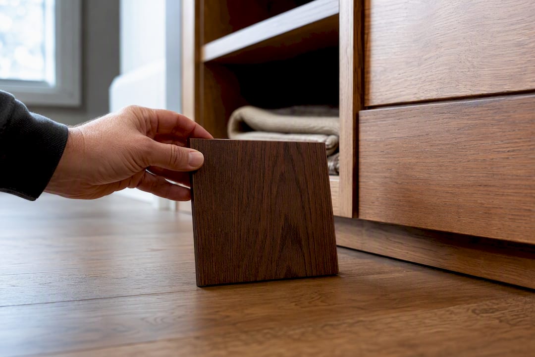
Consider the style you’re aiming for as a second filter. Farmhouse and rustic interiors lean toward warmer, more weathered tones with visible grain. Modern and minimalist spaces often favor gray, black, or ebonized stains that flatten the wood’s natural warmth. Traditional interiors tend to favor classic mid-tone browns like chestnut or cherry that read as timeless rather than trend-driven.
Textiles matter more than people expect. A stain that looks perfect against bare walls can shift once a rug or upholstery enters the room. If you’re rethinking a rug alongside new furniture, understanding how color and mood interact in textiles helps you avoid a mismatch you won’t notice until both pieces are in the room together.
Finally, factor in metal and hardware finishes. Warm brass and gold hardware pair naturally with amber and honey stains, while brushed nickel and black hardware tend to complement cooler, grayer tones. Small details like these are often what separates a room that feels put together from one that feels like mismatched purchases.
Understanding Stain Color Charts and How to Interpret Them
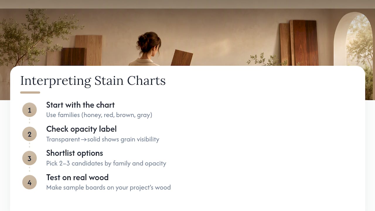
Stain color charts are useful, but they lie to you in one specific way: every swatch is printed or photographed on a single, ideal wood sample under studio lighting. Your project’s wood will not match that sample exactly, so treat the chart as a starting point for narrowing options, never as a final decision-making tool.
Manufacturer charts typically group colors by family, such as honey and golden oak tones, reds and cherries, browns and walnuts, and grays or “driftwood” finishes. Some charts also show the same color on two or three different wood species side by side, which is worth paying close attention to, since it demonstrates exactly the kind of shift discussed earlier with pine, oak, and maple.
Pay attention to the opacity label on each swatch, whether it says transparent, semi-transparent, semi-solid, or solid. That label tells you more about how the color will actually behave than the name of the shade does. “Golden Oak” and “Provincial” mean very little on their own; the opacity category tells you whether grain will still be visible once the stain dries.
Use the chart to shortlist two or three candidates in the right color family and opacity range, then move immediately to physical sample boards on your actual wood. The chart’s job is to narrow a hundred options down to three. The sample board’s job is to make the final call.
Author Perspective: Why Sample-First Wins
Pick the color, test it on your actual wood, then apply with disciplined timing. That sequence works because stain color is never fixed. It’s a negotiation between pigment, species, and light, and only a sample board settles the argument. Bring your top three swatches, a scrap of your real wood, and a phone camera to check the sample under your own bulbs at home.
— Wood
Sources
For deeper reading on the standards behind this guide: Minwax’s staining tips covers common application errors, Sherwin-Williams’s color guide explains opacity categories, Benjamin Moore’s stain guide details lighting tests, and Lowe’s staining walkthrough breaks down sanding grit progression.
- How to choose stain colors – Sherwin-Williams
- How to choose a wood stain color – Benjamin Moore
- How to stain interior wood – Lowe’s